
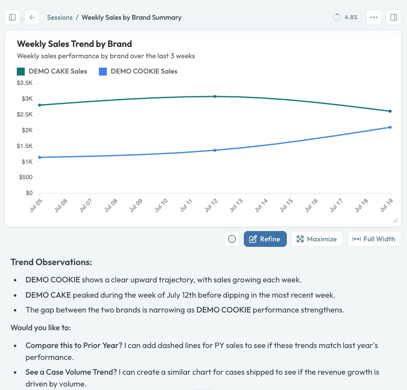
A line chart rendered inline with Refine, Maximize, and Full-width actions.
How charts are created
You do not need to write any code. Describe what you want to see — “show me weekly revenue by region as a stacked bar chart” — and the charting agent takes care of the rest. Behind the scenes the agent:- Queries the appropriate semantic model for the data.
- Creates a chart using Crisp’s visualization patterns.
- Renders it with your account’s light or dark theme.
Interacting with charts
Expand and collapse
Click the expand icon on any chart to open it at full width. The expanded view is fully responsive and adapts to your window size. Click the collapse icon or press Escape to return to inline view. Charts scroll vertically when the SVG content exceeds the container height — useful for small-multiples grids.Light and dark mode
Charts automatically adapt to your current theme. If you switch between light and dark mode, charts re-render with appropriate colors, backgrounds, and contrast. Brand colors (for example, a company’s logo palette) are automatically adjusted for dark-mode readability. Chrome’s Auto Dark Mode does not invert chart or app colors.Hex color previews
When the agent references hex color codes in its response (for example,#FF6B35), a small color swatch appears next to the code so you can see the color without leaving the conversation.
Chart types
Agents can produce a wide range of chart types:Including external images
Charts can include external images such as company logos, product photos, or brand marks. Ask the agent to add the image and provide the URL — for example, “add the Crisp logo from https://example.com/logo.png to the top-right corner.” The agent downloads the image into the session’s file storage and embeds it directly in the chart, so the image travels with the chart wherever it is exported or shared. This means logos and other images render correctly in PNG exports, email reports, and PDF deliveries — even on devices that cannot reach the original URL. If an image fails to download (for example, the URL requires authentication or returns an error), the agent will let you know and continue without it. You can also upload images to your session first and then ask the agent to include them by file name.Refining charts
If a chart is close but not quite right, you can refine it without starting over. Click the Refine button on any chart to open a split-pane modal:- Left pane — Live preview of the chart.
- Right pane — A chat interface where you describe changes (“make the bars blue”, “add a trend line”, “move the legend below the chart”).
Copying charts
Charts can be copied directly from the session. Click the 3 little dots on the chart toolbar to copy the visualization. Charts also render correctly in email reports and PDF exports when delivered via scheduled runs.Tips for better visualizations
- Request specific time periods — “last 13 weeks” or “Q4 2024” rather than “recently”.
- Specify groupings — Tell the agent how to break down data (“by week”, “by product category”, “by store location”).
- Limit result size — Ask for “top 10” or add a threshold filter for clearer charts.
- Ask for a chart type — If the agent picks the wrong type, just say “show that as a bar chart instead”.